| | New Loading Screen |  |
|
+11diaster SinisteRing Lagger09 BashAndSmash Jay.J Rhys Zync AquaAscension ÐeathByCyanide Dragonheart91 Fritz 15 posters |
|
| Author | Message |
|---|
Fritz
Mage

Number of posts : 56
Registration date : 2009-02-14
Your Character
Level: 1
Primary Move: Change This To Your Own Special Move In Your Profile
| | Subject: New Loading Screen Mon Feb 16, 2009 1:25 am | |
| This is a mock of some things that could be used for the loading screen for MM&M. I'll post more as I make them. This one is not complete yet... I've still yet to do the top. I don't know what to put there. :/ | |
|
| | |
Dragonheart91
Godlike Sage


Number of posts : 2358
Registration date : 2008-05-21
Your Character
Level: 1
Primary Move: Cursed Waves (pwned much?)
| | Subject: Re: New Loading Screen Mon Feb 16, 2009 2:01 am | |
| I like it. It's time for us to change out loading screen. The top needs more stuff, but what you have so far looks great.
P.S. It's Zync, not "Zinc". | |
|
| | |
Fritz
Mage
Number of posts : 56
Registration date : 2009-02-14
Your Character
Level: 1
Primary Move: Change This To Your Own Special Move In Your Profile
| | Subject: Re: New Loading Screen Mon Feb 16, 2009 2:42 am | |
| /sarcasm Who gives a shit how his name is spelled.. I got the sound right 
Last edited by Fritz on Mon Feb 16, 2009 3:29 am; edited 1 time in total | |
|
| | |
Dragonheart91
Godlike Sage
Number of posts : 2358
Registration date : 2008-05-21
Your Character
Level: 1
Primary Move: Cursed Waves (pwned much?)
| | Subject: Re: New Loading Screen Mon Feb 16, 2009 2:49 am | |
| | |
|
| | |
Fritz
Mage
Number of posts : 56
Registration date : 2009-02-14
Your Character
Level: 1
Primary Move: Change This To Your Own Special Move In Your Profile
| | Subject: Re: New Loading Screen Mon Feb 16, 2009 3:11 am | |
| I was joking. Question: Should lightning be light blue/teal or yellow? | |
|
| | |
ÐeathByCyanide
GFX Artist

Number of posts : 524
Registration date : 2008-05-21
Your Character
Level: 1
Primary Move: Combustion-
| | Subject: Re: New Loading Screen Mon Feb 16, 2009 3:33 am | |
| - Fritz wrote:
- I was joking. Question: Should lightning be light blue/teal or yellow?
Use the golden/yellow/brownish colors. Teal wouldn't go with with the rest of it. And you could make Mages more prominent. Or alternatively add a light source somewhere. And or move the book, its a render anyways, right? And for the rest of it, you could add another render, and add some smudging to the book. With some photo filters, and gradient overlays. | |
|
| | |
Fritz
Mage
Number of posts : 56
Registration date : 2009-02-14
Your Character
Level: 1
Primary Move: Change This To Your Own Special Move In Your Profile
| | Subject: Re: New Loading Screen Mon Feb 16, 2009 4:34 am | |
| This is the next update on it. I repositioned the text box to give the loading bar space, and placed the website centered below the load bar. Additionally, I added the 8 elements with a title and icon, as well as an instruction box on how to play. I'm not liking how the title I made looks, so I will re-touch that to give it the better golden feeling I was looking for. Thanks for the advice on how to change the image. I'll play around with it and post what progress I make.  | |
|
| | |
Dragonheart91
Godlike Sage
Number of posts : 2358
Registration date : 2008-05-21
Your Character
Level: 1
Primary Move: Cursed Waves (pwned much?)
| | Subject: Re: New Loading Screen Mon Feb 16, 2009 4:40 am | |
| That font is neigh impossible to read. It looks cool, but I would suggest changing it to something legible. | |
|
| | |
Fritz
Mage
Number of posts : 56
Registration date : 2009-02-14
Your Character
Level: 1
Primary Move: Change This To Your Own Special Move In Your Profile
| | Subject: Re: New Loading Screen Mon Feb 16, 2009 4:46 am | |
| Really? I thought it was easy to read. That box gives new players something to read while it's a really longgg load. Wait... do you mean the title or the smaller text? | |
|
| | |
AquaAscension
Legendary

Number of posts : 580
Registration date : 2008-05-21
Your Character
Level: 1
Primary Move: Flying Dragon Kick
| | Subject: Re: New Loading Screen Mon Feb 16, 2009 5:13 am | |
| I think that picture is amazing. It is very well done and looks pretty damn sweet. The one critique I'd have is that the first, capital letter of each of the elements and the name of the map is very hard to read. I.e. all the "M's" in Mages Magic and Mayhem...
Otherwise, awesome. | |
|
| | |
Zync
Elite Mage

Number of posts : 364
Registration date : 2008-06-20
Age : 39
Location : Arizona
Your Character
Level: 1
Primary Move: Karate Chop
| | Subject: Re: New Loading Screen Mon Feb 16, 2009 5:23 am | |
| I think it kicks ass. It's has an appropriate style with great creativity and a logical layout. What else could you ask for?! | |
|
| | |
Fritz
Mage
Number of posts : 56
Registration date : 2009-02-14
Your Character
Level: 1
Primary Move: Change This To Your Own Special Move In Your Profile
| | Subject: Re: New Loading Screen Mon Feb 16, 2009 5:58 am | |
| I need a favor from someone who can do this... I need the metal frame from the original loading screen to add to the loading screen image. Could someone cut the metal part and put it on top of a transparent background?  | |
|
| | |
Rhys
Map Maker

Number of posts : 719
Registration date : 2008-05-23
Age : 42
Location : Massachusetts
Your Character
Level: 1
Primary Move: Atomic Tea-Bag
| | Subject: Re: New Loading Screen Mon Feb 16, 2009 10:12 am | |
| Well i think its starting to look pretty good with that second update of yours.
Eight I think is being spelled Eilght?
The M's are a bit tough to read but all in all this looks pretty damn cool. | |
|
| | |
Jay.J
Head Admin

Number of posts : 3470
Registration date : 2008-05-21
Age : 33
Location : Toronto
Your Character
Level: ∞
Primary Move: Moderate
| | Subject: Re: New Loading Screen Mon Feb 16, 2009 11:21 am | |
| I like it. Even if the M's are tough to read it doesn't matter considering the game's name is MM&M . Also - would you like to be invited into the artist group? I think you qualify  . | |
|
| | |
Fritz
Mage
Number of posts : 56
Registration date : 2009-02-14
Your Character
Level: 1
Primary Move: Change This To Your Own Special Move In Your Profile
| | Subject: Re: New Loading Screen Mon Feb 16, 2009 12:31 pm | |
| Yeah, it was spelled 'Eilght'. Fixed that... If you want to make me an artist, okay, but I'm only making art for things I want to do. I wouldn't think of myself as a community artist. | |
|
| | |
Dragonheart91
Godlike Sage
Number of posts : 2358
Registration date : 2008-05-21
Your Character
Level: 1
Primary Move: Cursed Waves (pwned much?)
| | Subject: Re: New Loading Screen Mon Feb 16, 2009 1:23 pm | |
| Yeah, only the first letters are hard to read. Also, I think we should have someone else write the how to play section. Other than that, great job. The loading screen looks awesome. | |
|
| | |
BashAndSmash
Moderator

Number of posts : 399
Registration date : 2008-05-21
Your Character
Level: 1
Primary Move: I Zap You
| | Subject: Re: New Loading Screen Mon Feb 16, 2009 1:34 pm | |
| The How to play section looks fine. And as other have said the scrollwork on the first letters are hard to read. | |
|
| | |
Dragonheart91
Godlike Sage
Number of posts : 2358
Registration date : 2008-05-21
Your Character
Level: 1
Primary Move: Cursed Waves (pwned much?)
| | Subject: Re: New Loading Screen Mon Feb 16, 2009 1:38 pm | |
| If necessary, I'll rewrite it. I think there are more important things to say in it, no offense. | |
|
| | |
AquaAscension
Legendary
Number of posts : 580
Registration date : 2008-05-21
Your Character
Level: 1
Primary Move: Flying Dragon Kick
| | Subject: Re: New Loading Screen Mon Feb 16, 2009 1:47 pm | |
| Yeah, but you always do that dragon. You have this sense that everything is not quite as good as you can make it. That's not necessarily false just... meh. I'm just glad that, as far as I can tell, he has correct grammar.
As for the metal framework... yeah, nope not going to happen here. Maybe someone who knows what he/she is doing can help out with that? | |
|
| | |
Lagger09
Legendary

Number of posts : 535
Registration date : 2008-05-23
Age : 31
Location : SoCal
Your Character
Level: 1
Primary Move: I am the Destroyer of Time... guess...
| | Subject: Re: New Loading Screen Mon Feb 16, 2009 1:55 pm | |
| As everyone has already said, plz redo the 1st letter of every large word. I also think that the Caligraphy style lettering doesn't work well with all 8 elements, it only really fits with Light. Maybe make an image for each icon that isn't just the spellbook, because they seem a bit out of place with the overall style atm.
On the last line of the Info section, add something about latest version being on the website also.
What if you used the banner that DBC made for the top of the forums and used that for a represntaion of all 8 elements? | |
|
| | |
ÐeathByCyanide
GFX Artist
Number of posts : 524
Registration date : 2008-05-21
Your Character
Level: 1
Primary Move: Combustion-
| | Subject: Re: New Loading Screen Mon Feb 16, 2009 1:58 pm | |
| I could do it, but it will take awhile. | |
|
| | |
Fritz
Mage
Number of posts : 56
Registration date : 2009-02-14
Your Character
Level: 1
Primary Move: Change This To Your Own Special Move In Your Profile
| | Subject: Re: New Loading Screen Mon Feb 16, 2009 2:00 pm | |
| Another update... I don't really like how the elements are set up but I'm running short on ideas of what to put there. It's hard and time consuming creating a little logo / rune for each element. If someone else wants to do it and have me put it in, that would be fine. I'm also going to take out the icon reflections (if not the icons entirely) soon. 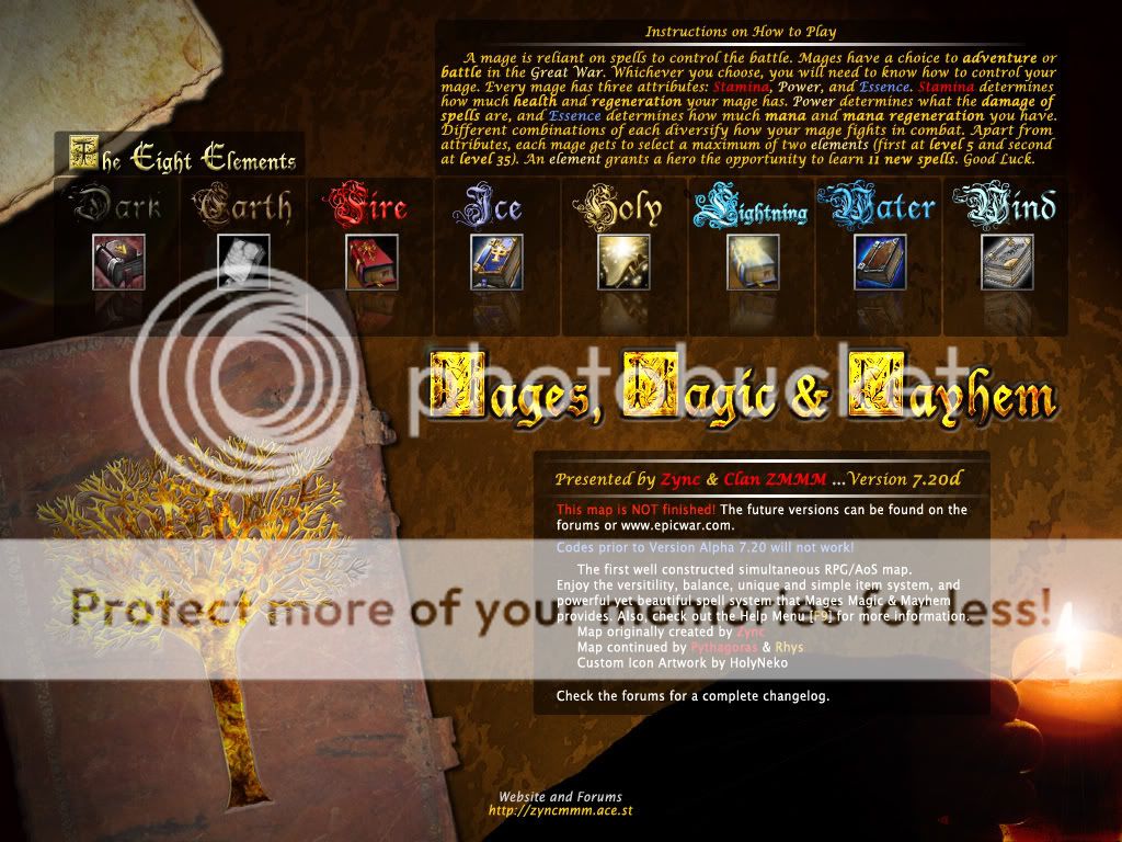 | |
|
| | |
Rhys
Map Maker
Number of posts : 719
Registration date : 2008-05-23
Age : 42
Location : Massachusetts
Your Character
Level: 1
Primary Move: Atomic Tea-Bag
| | Subject: Re: New Loading Screen Mon Feb 16, 2009 2:08 pm | |
| either way contact me on msn so we can discuss this. | |
|
| | |
ÐeathByCyanide
GFX Artist
Number of posts : 524
Registration date : 2008-05-21
Your Character
Level: 1
Primary Move: Combustion-
| | Subject: Re: New Loading Screen Mon Feb 16, 2009 2:12 pm | |
| - Fritz wrote:
- Another update... I don't really like how the elements are set up but I'm running short on ideas of what to put there. It's hard and time consuming creating a little logo / rune for each element. If someone else wants to do it and have me put it in, that would be fine. I'm also going to take out the icon reflections (if not the icons entirely) soon.
Looks good. The only suggestions I have are; 1). Fix the choppiness on the hand with a soft brush. (I liked the idea for the light source though). 2). Use different colors for the Dark, and Earth texts. Something more like the others. In Brightness/Contrast. 3). Try making the edges softer on the flipped icons that are slightly transparent. (I like them there). Like the Earth one, where it looks like only the book is actually reflecting. 4). Do you have a bigger resolution? | |
|
| | |
Fritz
Mage
Number of posts : 56
Registration date : 2009-02-14
Your Character
Level: 1
Primary Move: Change This To Your Own Special Move In Your Profile
| | Subject: Re: New Loading Screen Mon Feb 16, 2009 2:14 pm | |
| I only made it 1024x768, but I could expand it. | |
|
| | |
Sponsored content
| | Subject: Re: New Loading Screen | |
| |
|
| | |
| | New Loading Screen | |
|
